Live-Data Reporting: presentations and dashboards
Reporting in Cxoice is a built in feature. Cxoice can create tabulations, charts, presentations and data dashboards on demand, with ‘live-data’ connections so they pull the data from the live data source and can apply filters and drill-downs instantly.
Reports are created automatically, direct from the questionnaire definition. This means that reporting turnarounds can be extremely fast.
Cxoice can have many different reports set up, and each report can also be edited and customised using the Report Editor giving full customisation on the output. This allows you to create presentations for different groups, summaries and full data reports all in the same place.
For static charts, Cxoice will export data to Powerpoint, or can be shared as a .pdf file, but much of the power of Cxoice is in dynamic charts that are linked to the underlying data providing the ability to both tell the story, but also to dig down, to show the data details of how the story is built up.

Tabulations
The first report type are tabulations. Add a cross-break (also known as break or banner) of questions you want to use to understand subgroups.
Tables generate automatically based on the underlying question types. However, you can also edit the report definition to add summary tables into the tables run.
Charts for presentations
Cxoice creates live data charts that link to the underlying data extract, allowing for instant data drill down and results.
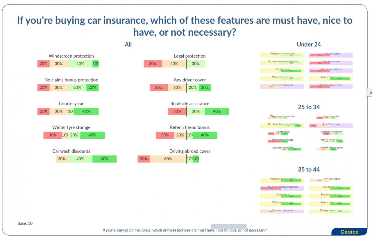
Charting in Cxoice is dynamic and interactive. Charts can be defined for a Presentation as run-on slides, or as a dashboard where all the items appear on the page together.
Presentation slides can include sub-charts for subgroups on the page with automatically generated display of significant differences from the main chart. This provides a deep and complete view without requiring lots of individual charts per subgroup.
Drill-downs to specific subgroups is done by simply clicking the subgroup chart to get a fuller pop-up.
For many chart types, data points can be sorted to see rankings live on the page and to help explore the data.
Data is always available per chart, both as tables and as chart data for importing into Excel and individual charts, and the whole chart set, can be exported to Powerpoint, though they will need further refining with Powerpoint styles.
Special chart types include Wordclouds which will allow drill-downs directly into the source quotes and write-ins.
For web-overlays and stickers and collage question types the chart shows where stickers were applied on the underlying website or image, with tools for filtering, scaling and viewing over time, in addition to simple counts of stickers use in different areas.
As with tabulations, the report definition can be edited directly. Charts can be added for text, titles and flow, including images and summaries.
Where data needs to be combined, you can also use chart types to pool data, or to show charts in different formats using DerivedMultiples, PieCharts, LineCharts etc.
Dashboards
For dashboards, the output can be customised into a final defined dashboard format accessible via password.